Brief: RGB, use only one colour, 2023
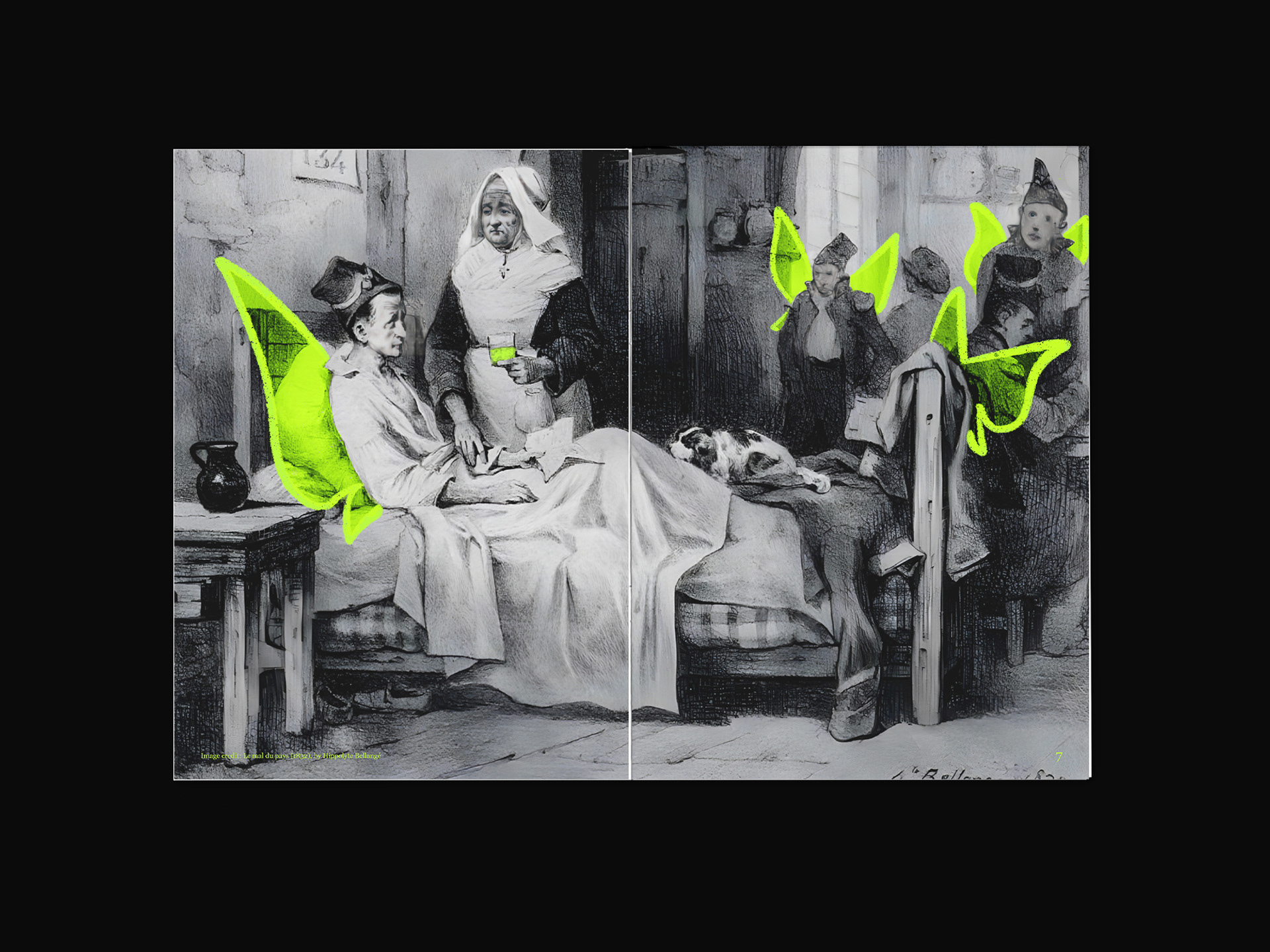
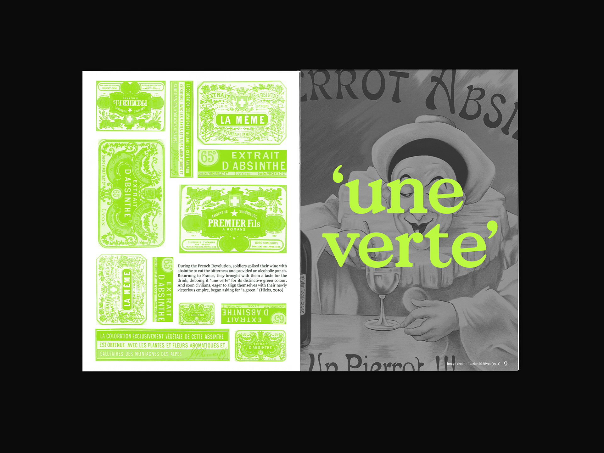
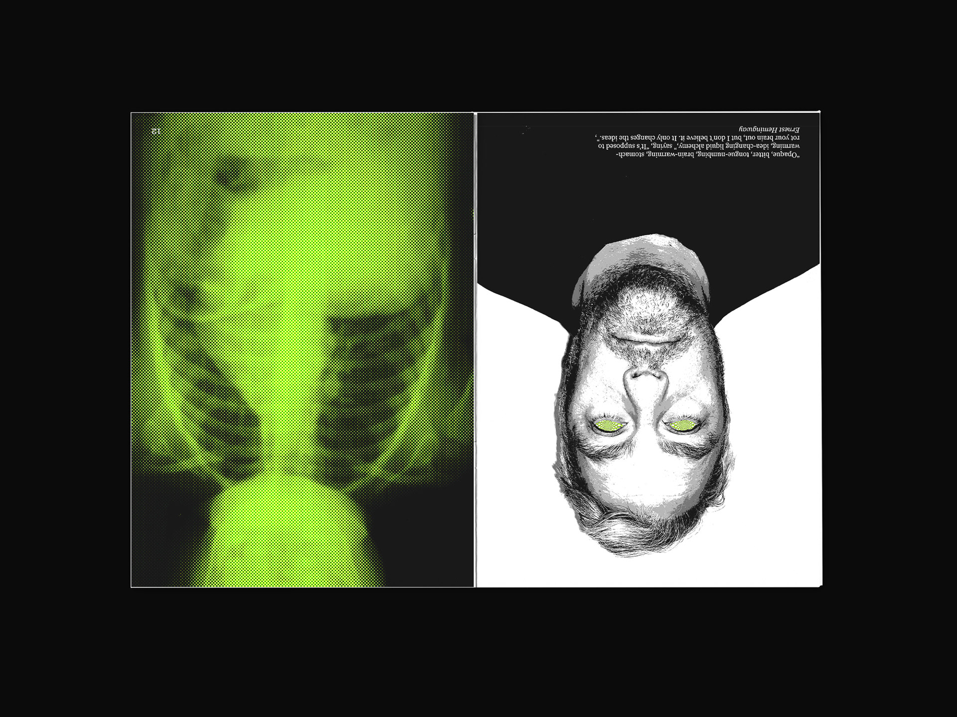
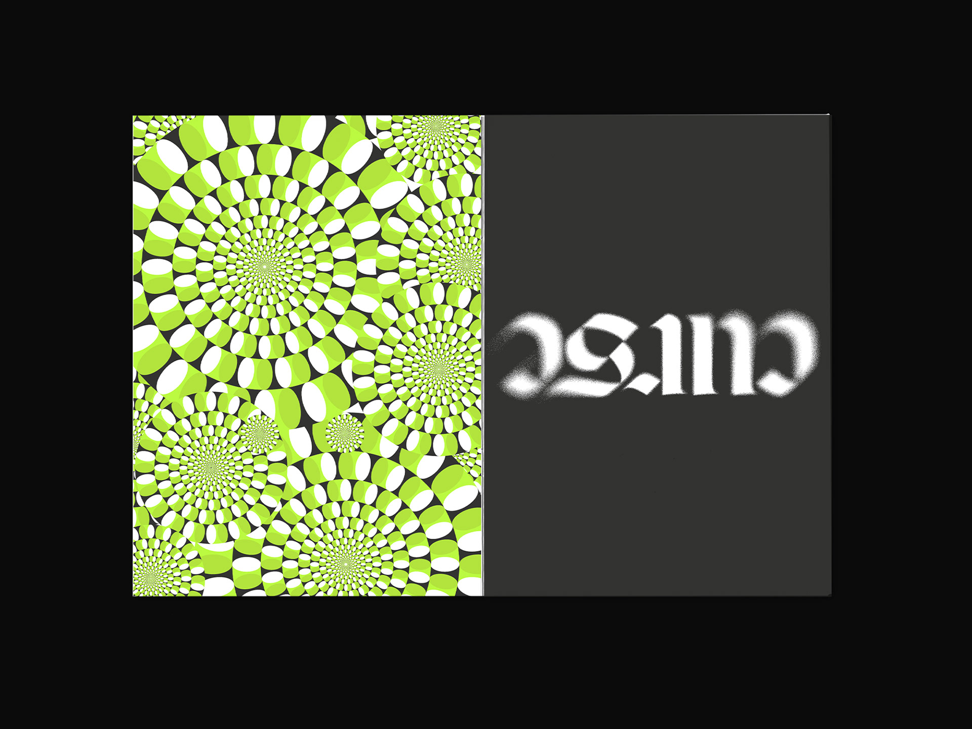
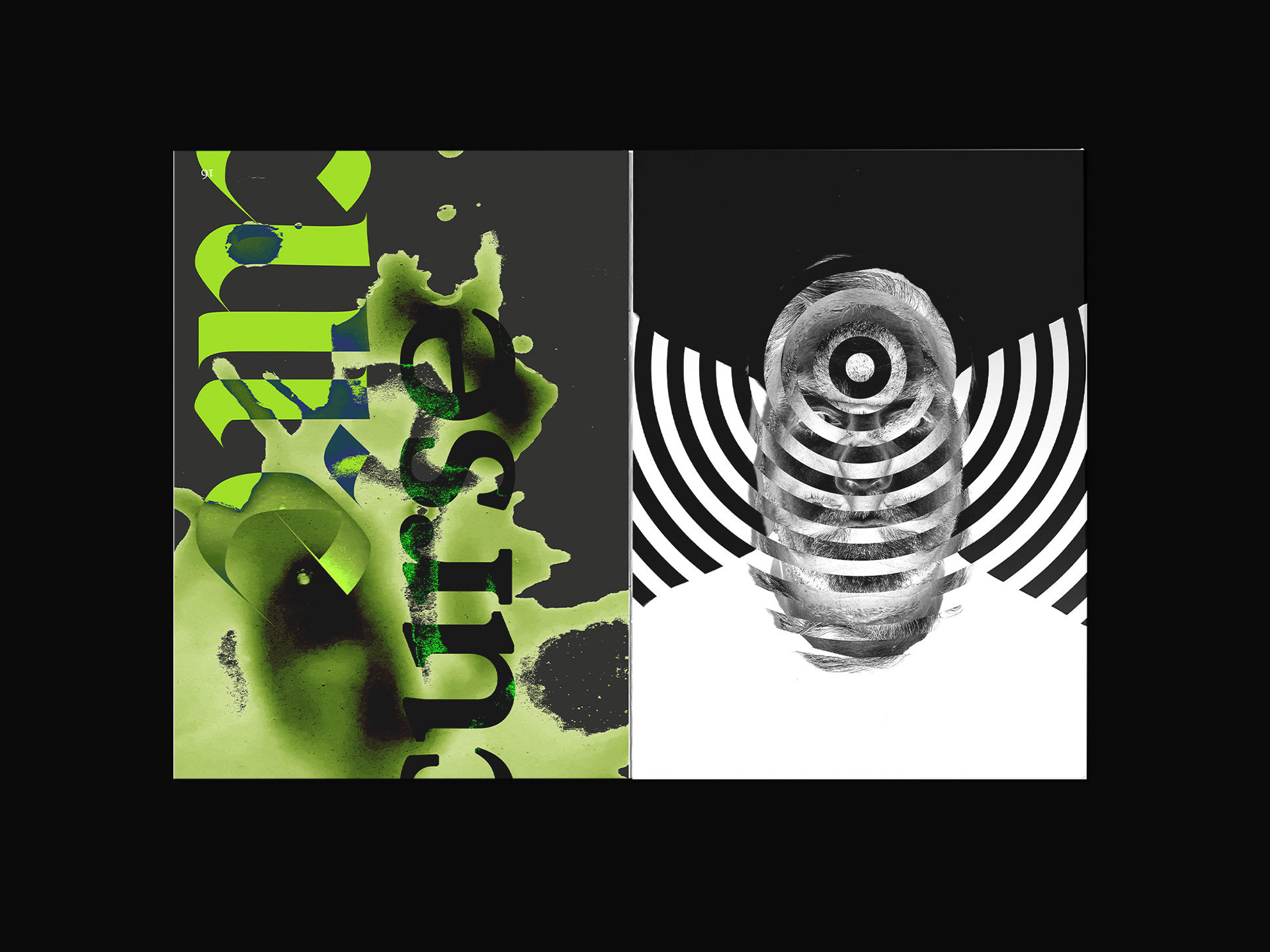
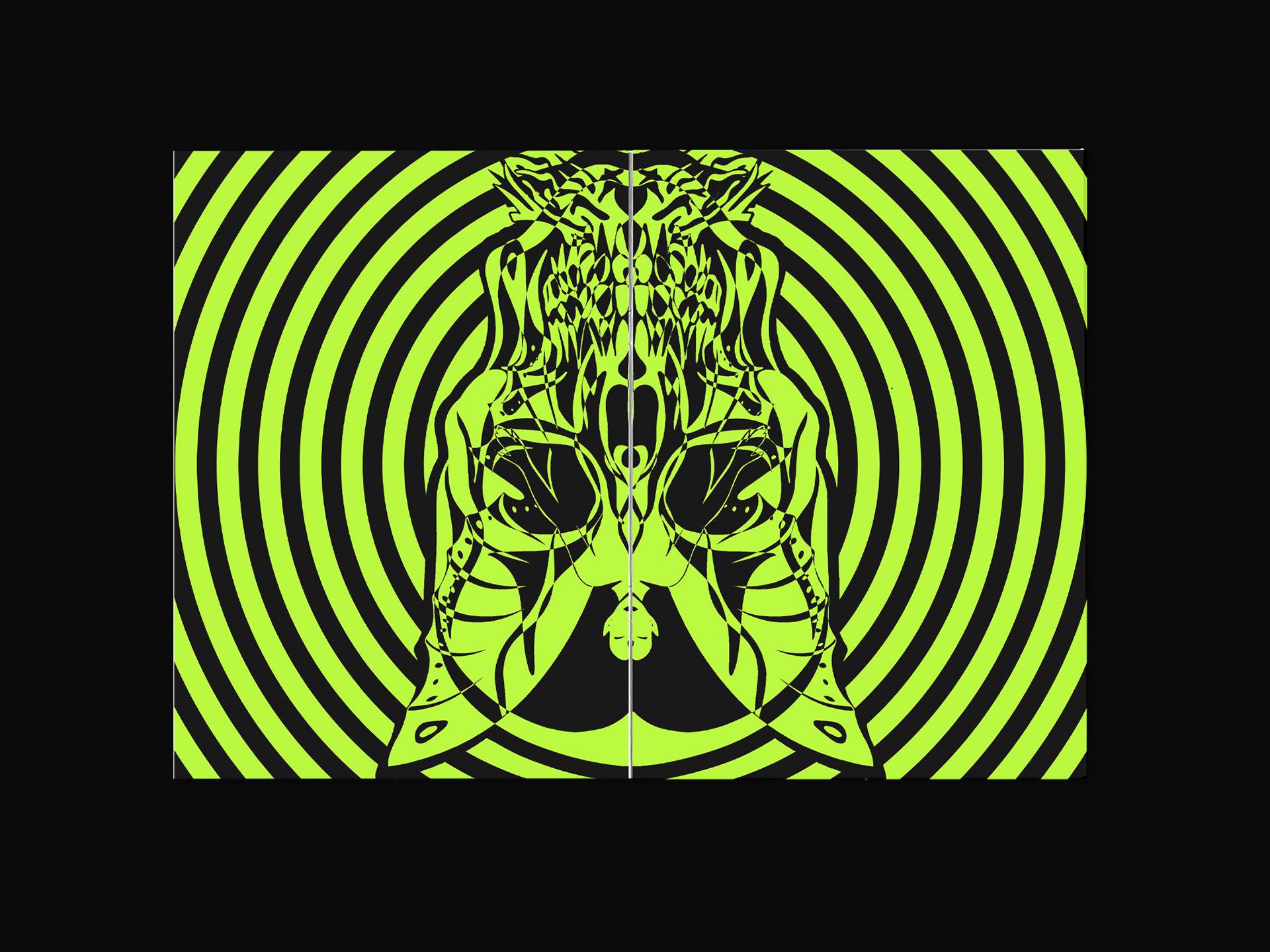
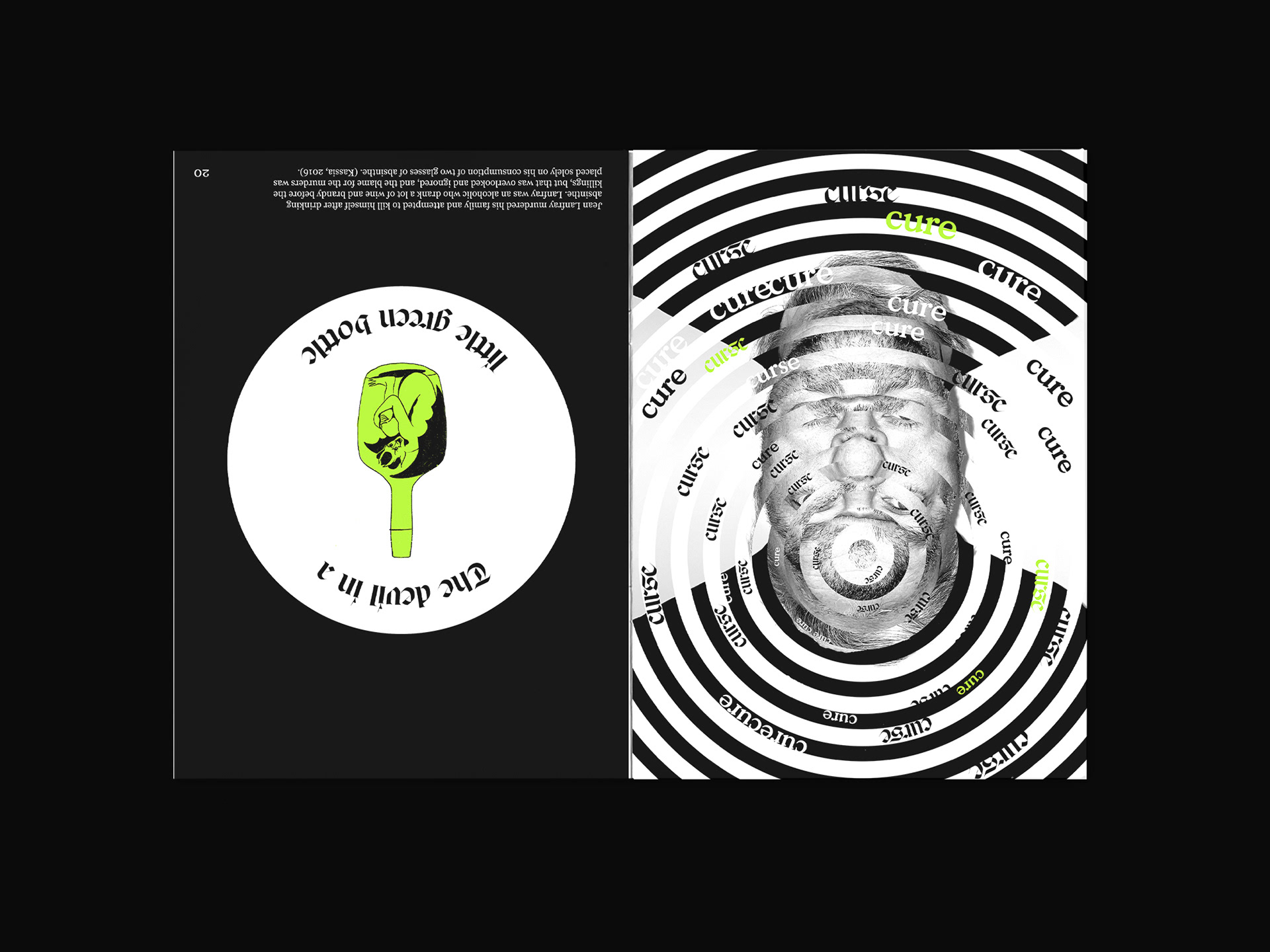
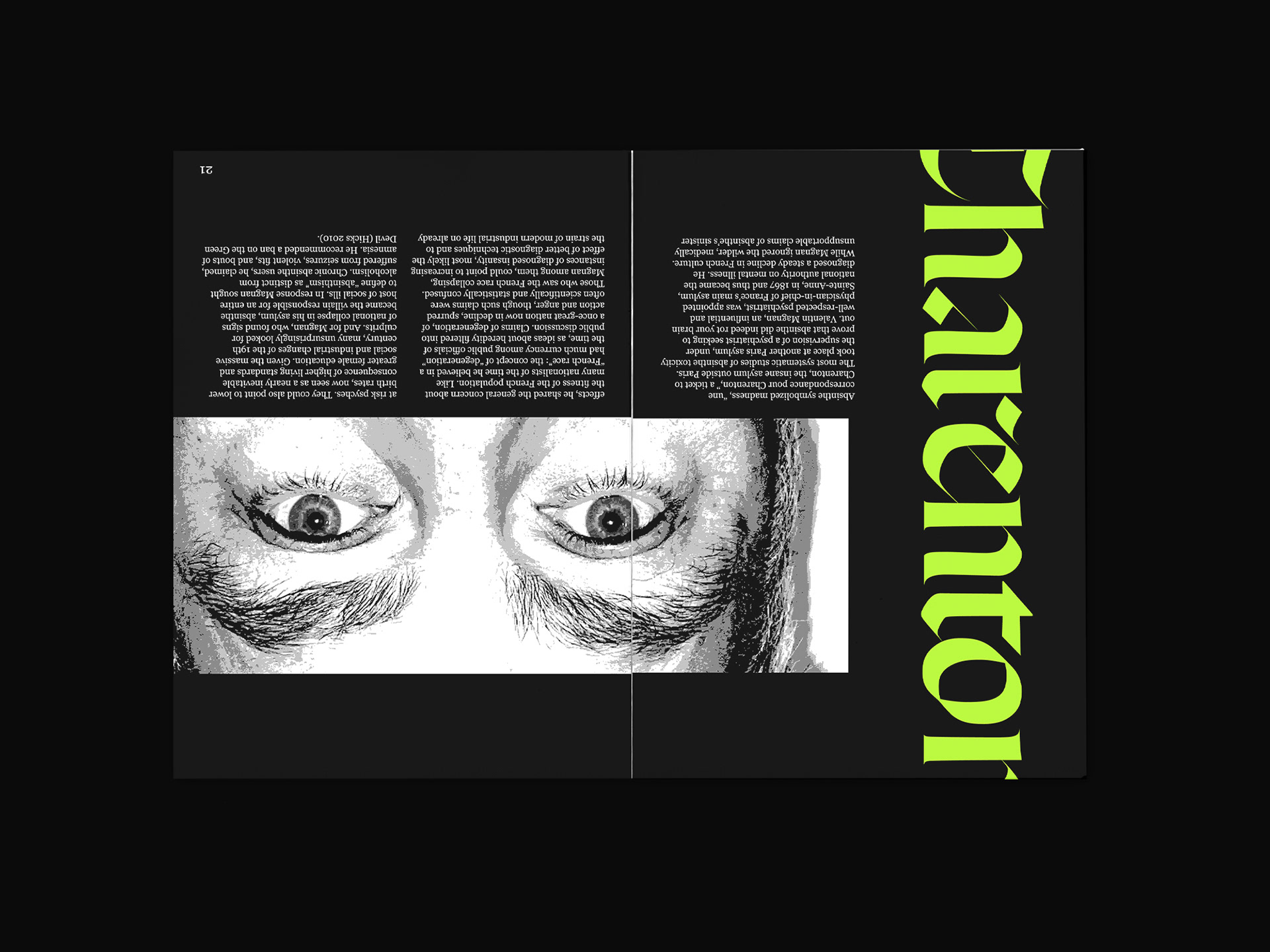
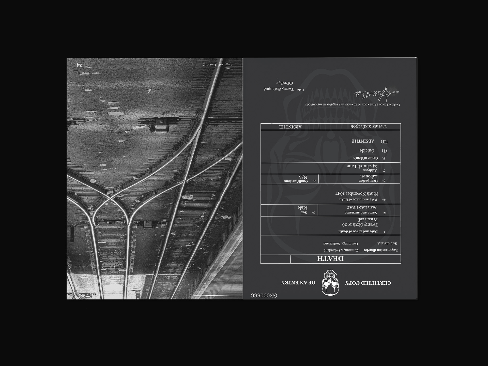
La Vie En Verte is a limited edition magazine which celebrates the controversial history of Absinthe. With the limitation of only using one colour, the magazine highlights the ‘good’ and ‘bad’ side to Absinthe by repeatedly contrasting elements. Optical illusions and image manipulation is used to demonstrate intoxication and the forms of identification represent one of Absinthe’s infamous victims.
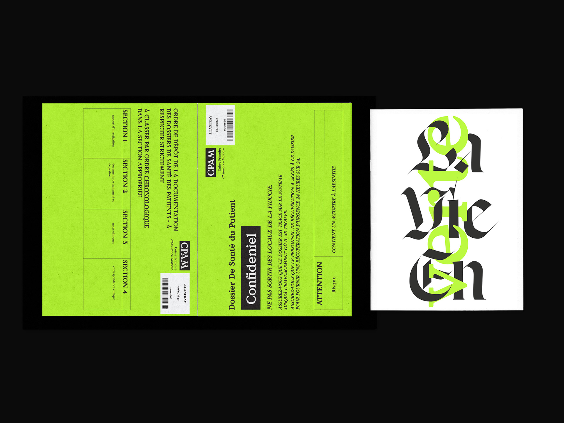
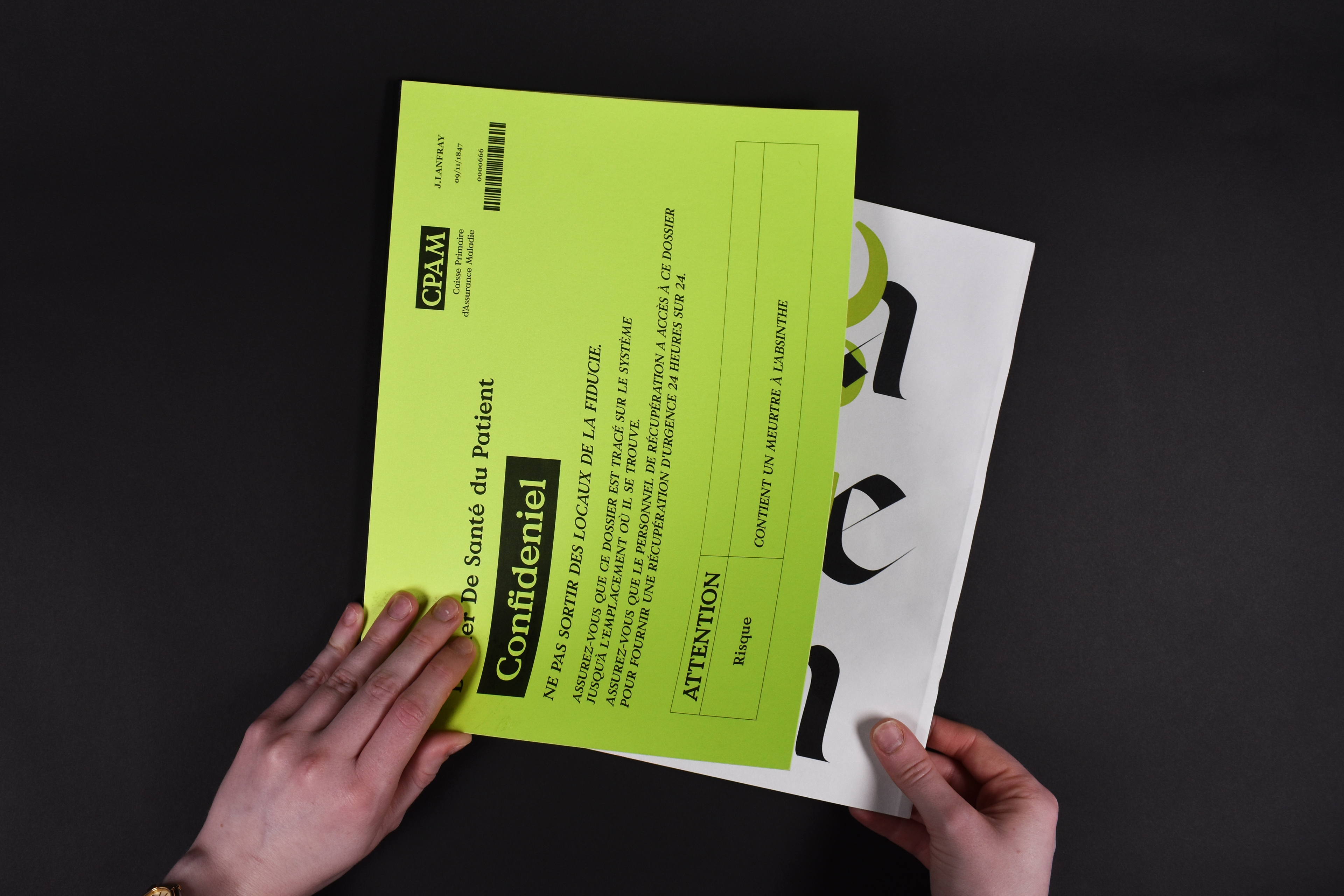
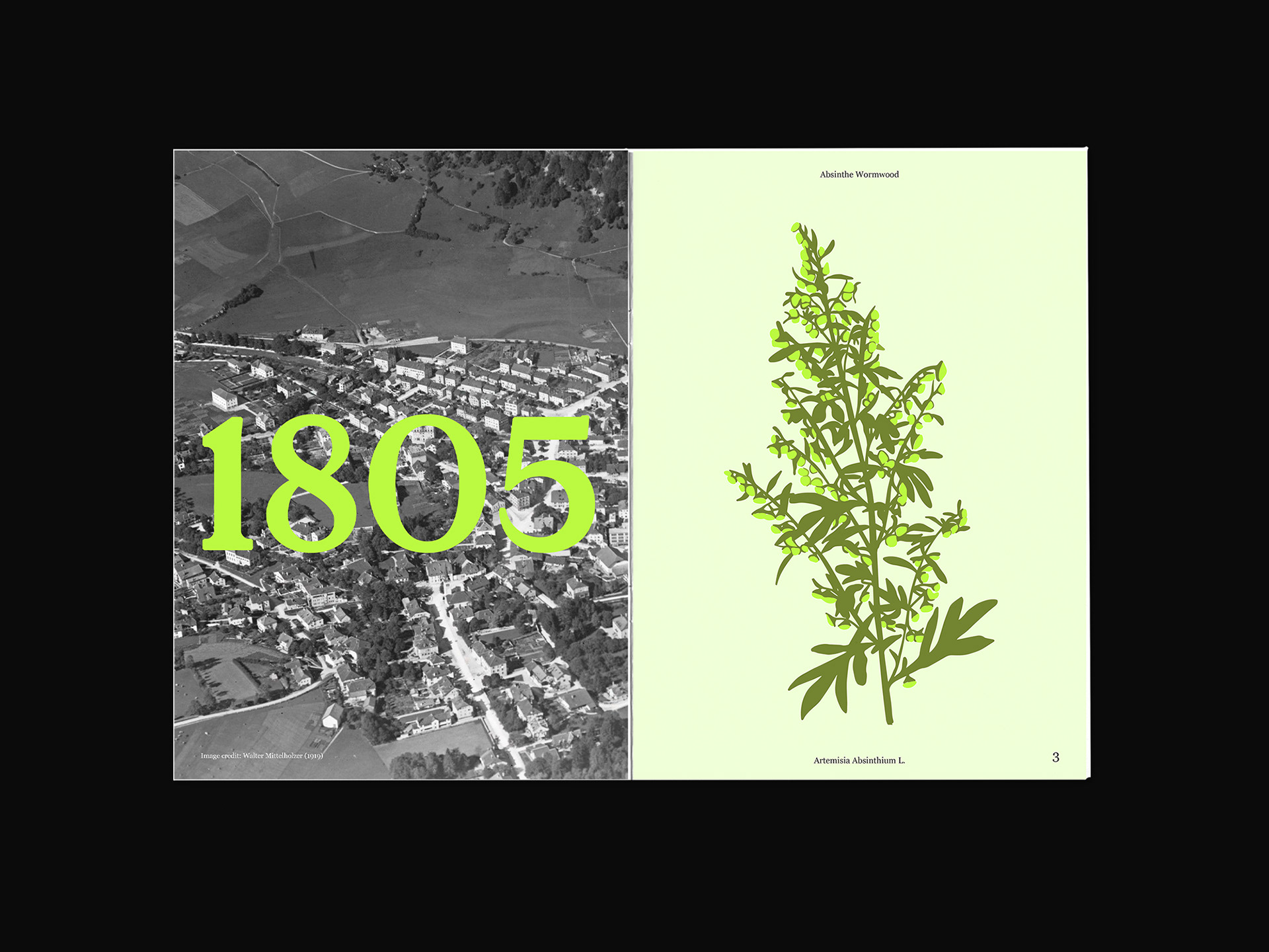
The magazine come within a sleeve which is inspired by a medical folder. The magazine itself is representing the files of the medical folder, as if it's telling the medical story of Absinthe's infamous victim from his life before and after Absinthe.
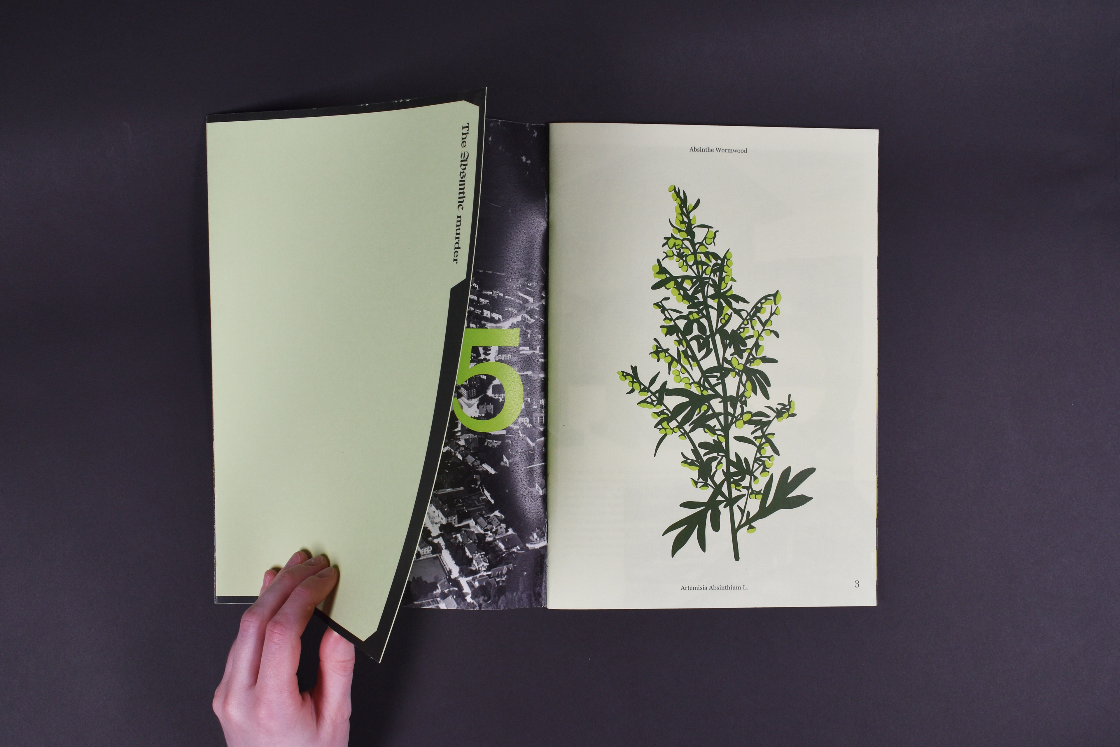

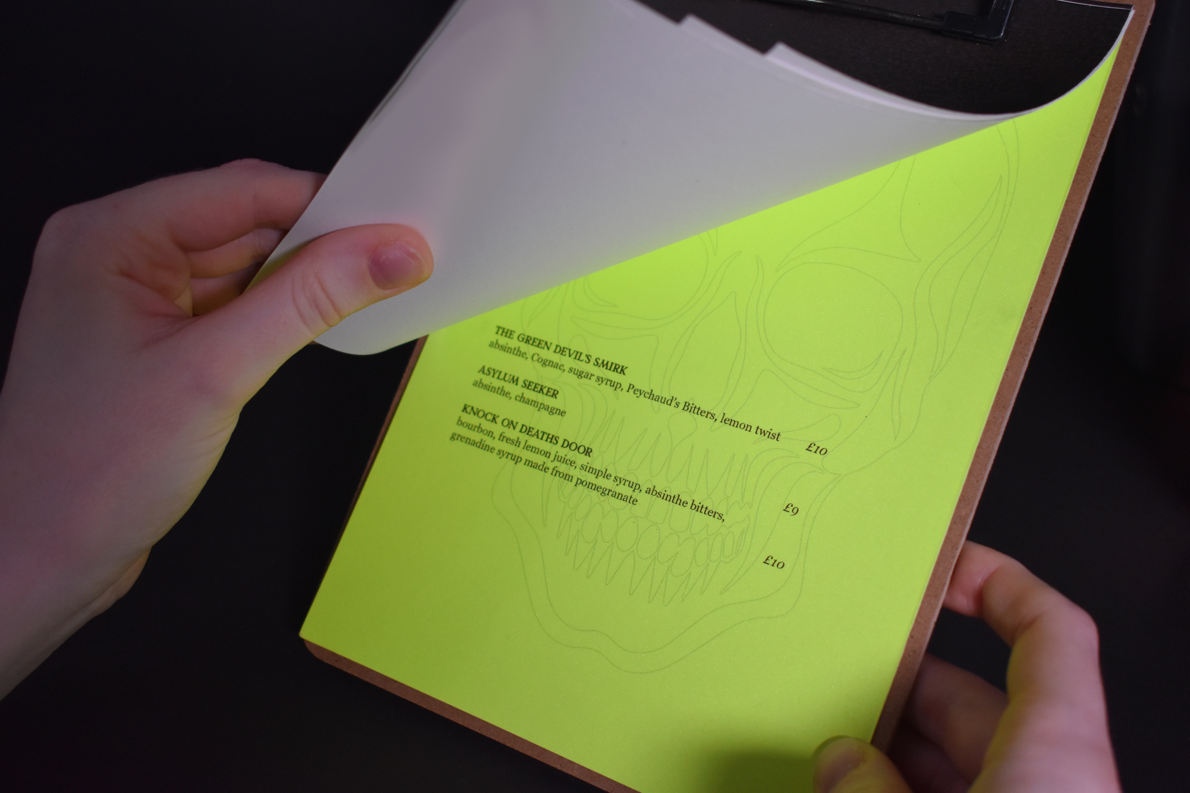
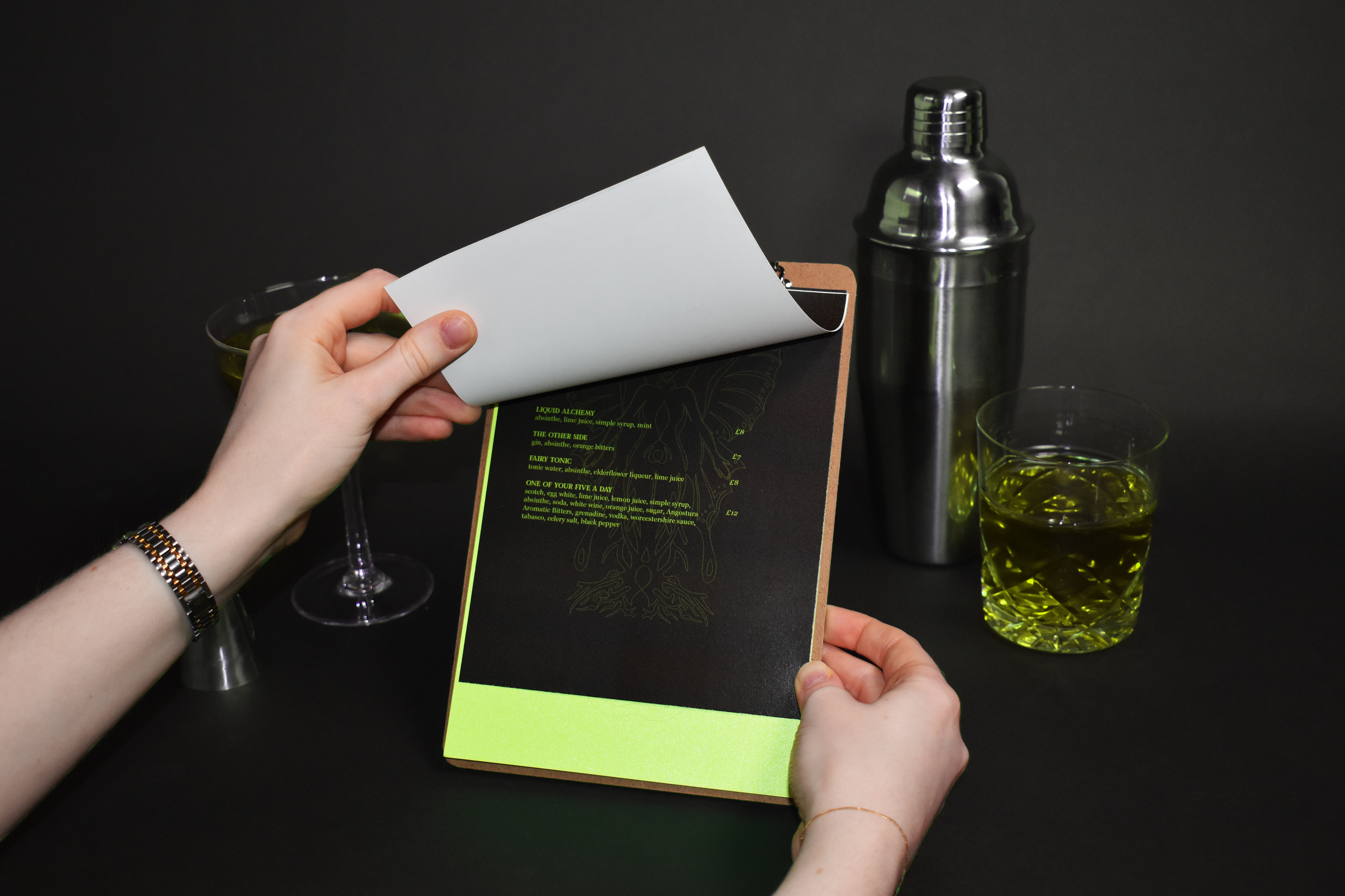
I took interactive elements like flaps from the Blow Press to engage the reader.


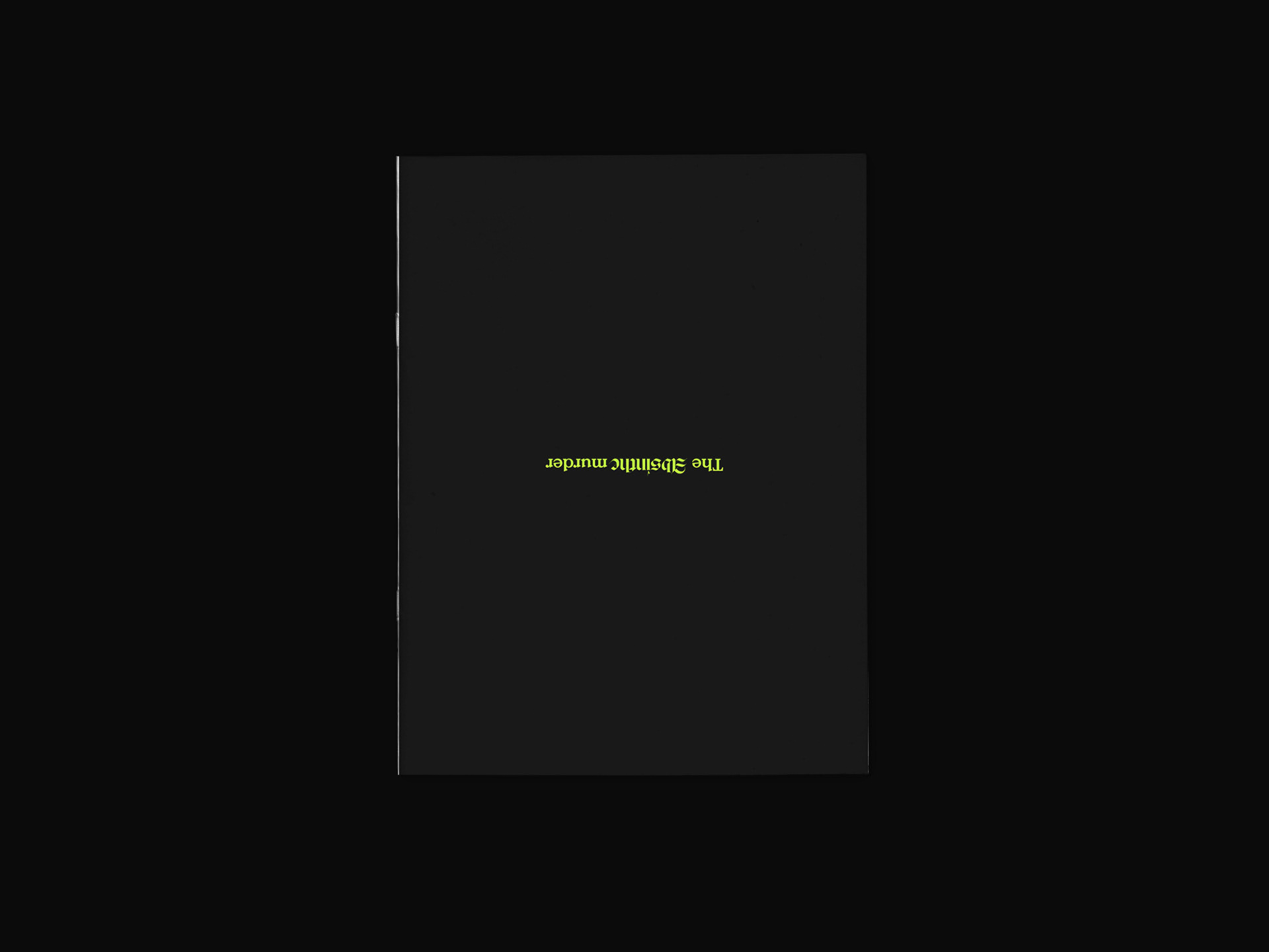
The magazine is purposefully flipped upside down to intensify the chaos and signify the transition from 'good' to 'bad'.

To promote the magazine I made a cocktail menu with bespoke drinks. There are three sections to the menu connecting back to the three stages of the magazine, the before, during and after Absinthe.